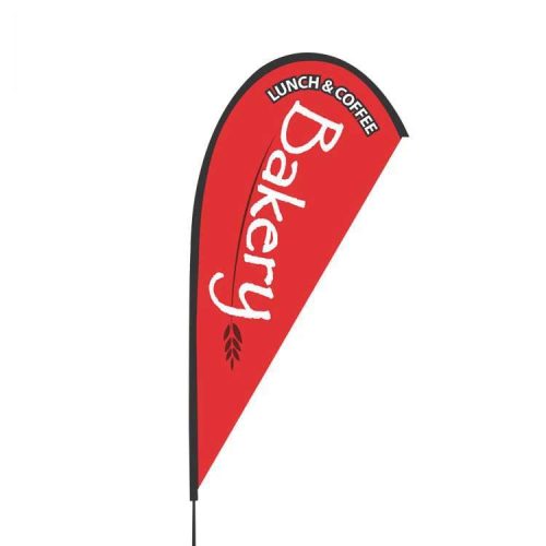
Typography plays a crucial role in effective feather flag design. Here are some tips for using typography to create effective feather flags:
- Choose legible fonts: The font you choose should be easy to read, even from a distance. Avoid using fancy or complicated fonts that can be difficult to decipher. Sans-serif fonts are generally a good choice for feather flags, as they are clean and easy to read.
- Use appropriate font sizes: The size of the font you use should be appropriate for the size of the feather flag. Text that is too small will be difficult to read, while text that is too large can be overwhelming and hard to take in.
- Consider font colors carefully: The color of the font you use should be highly visible and contrasting to the background color of the flag. Avoid using colors that clash or blend in with the background, as this can make your message hard to read.
- Keep the message short and simple: The message on your feather flag should be short and to the point. Avoid using too much text or trying to convey too many messages. Instead, focus on a clear and concise message that will stick in the minds of potential customers.
- Use hierarchy and spacing to create visual interest: By using different font sizes, weights, and spacing, you can create a hierarchy of information that guides the viewer’s eye and creates visual interest.
By using typography effectively, you can create feather flags that are highly visible, legible, and effective at conveying your message to potential customers. A well-designed feather flag can help you stand out from the competition and draw in more customers to your business.