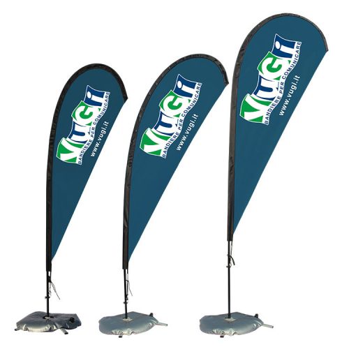
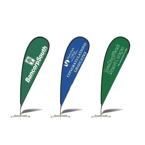
Here are some dos of feather flag design that can help you create an effective and visually appealing marketing tool:
- Do keep the message simple and clear: Feather flags are typically viewed from a distance, so it’s essential to keep your message concise and easy to read. Use simple, bold text to convey your message clearly and effectively.
- Do use high-quality graphics: High-quality graphics can make your feather flag stand out and grab attention. Use high-resolution images or vector graphics to ensure that your graphics are sharp and clear.
- Do use contrasting colors: Contrasting colors can help your feather flag stand out and make your message more readable. Choose colors that contrast with your background and ensure that your text is easy to read.
- Do use hierarchy and spacing: Using hierarchy and spacing can help you create a clear visual hierarchy and guide the viewer’s eye through your message. Use larger text for the most important message and increase the spacing between lines of text to improve readability.
- Do consider the placement of your logo and branding: Your feather flag should prominently display your logo and branding to help build brand recognition. Consider placing your logo and branding near the top of the flag to ensure that it is visible from a distance.
- Do use high-quality materials: Using high-quality materials for your feather flag can help ensure that it is durable and long-lasting. Choose materials that are weather-resistant and designed to withstand outdoor use.
By following these dos of feather flag design, you can create an effective and visually appealing marketing tool that can help you attract customers and build brand recognition.


